Tuesday, December 21, 2010
Thursday, December 16, 2010
Cabaret Designs, part 2
I finished my production book this morning! In celebration, here are two of my costume designs.


The Emcee

Sally
Saturday, December 11, 2010
Relay For Life
If you are reading this, you probably know that I'm really into Relay For Life and the American Cancer Society. I have been on my school's Relay For Life committee for the past two years (this year, the meeting time changed and I've been unable to attend; we'll see how things go second semester). Anyway, our theme for this year's Relay is Time Travel.
If you know me, you probably know how much I hate time travel. But there is one time travel-y thing that I like, and that's Doctor Who. My love for that show surpasses my hatred its disregard for basic physics.
So this year, my darling roomie and I will be on a Doctor Who-themed team - Team Bad Wolf. For an explanation of the name Bad Wolf, go to our team page.
I made a fun little animated gif for our page, completely forgetting that the ACS website wouldn't be able to host it. So I figured I'd share it here.
version 1 - not smooth, but it mimics the TARDIS's flash really well
version 2 - a lot smoother, but it doesn't do a good job with the TARDIS flash
Anyway, hope you Doctor Who fans out there will enjoy these. I'm upset because my computer totally crashed in October and I lost all of my software, and I can't find the gif animator I used to use. It was a really awesome free download software, but I haven't been able to find it and reinstall it, so I've been using a terrible internet-hosted one. Bah. If you happen to have free download software, tell me where I can get it and how much you like it.
And if you'd like to donate to me for Relay, please do so at my personal page.
Thursday, December 9, 2010
Cabaret Designs, part 1
Well, it's finals week here at school. One of my final projects is a production book for a musical of my choosing. I've decided to design Cabaret. The show will be sort of a marriage between circus arts and Brecht's Epic Theatre. These are the makeup designs I've got so far. What do you think?

Sally

Chorus Girls

The Emcee
Tuesday, December 7, 2010
Hypothetical Save-The-Dates
Finals are approaching, which means that I'm looking for ways to not do work (as evidenced by the recent creation of this blog). One thing that I find is that I do a lot of graphic design when I'm procrastinating. It's strange, because I'm studying writing, and I wonder: if I had gone to school for graphic design, would I write in order to put off design work? Food for thought.
Anyway, last night I got bored - the two classes that I have to write papers for this week happen to be two of the worst classes I've taken at school thus far - and I decided to make some hypothetical save-the-dates for Jess. I've been really fascinated by a lot of typography-centric save-the-dates that I've seen on wedding blogs recently, especially Green Wedding Shoes, so I decided to give it a whirl using the sunset color scheme that I came up with earlier. This is what I came up with:

Overall, I'm quite pleased with how this came out, especially since this is my first go at something like this. Jess liked it, although she said that from far away it "looked kind of like a bingo card," and I have to agree. There are several things that I would change if I were to do it over again.
1. Silhouettes. If I had the time, I would do custom silhouettes. It would be totally awesome. I would use just the head and neck, and I would utilize the space better. But these were the silhouettes that I was working with, and I didn't feel like playing around with them.
2. The story section - if you're not really into typography, you should skip this. The program I am using is Paint.Net, which is a lovely (free!) program with just a few things that bug me. For starters, you can't go back in and re-edit text, which can be problematic. The other major issue that was particularly challenging for this project was that there is no "justify" setting for text. Since I wanted to justify, I had to use a monospaced (fixed width) font to measure things out. It was very limiting, and I really wanted a nice, rounded sans serif like Century Gothic. I went dafont.com to see what I could find. I tried a few things out, and what I ended up going with was Futurist Fixed. I like it, but it's not exactly what I was going for. The characters just seem too narrow. If I were to do this again, I would either download Typewriter (Courier New just wasn't cutting it - it didn't look right) or search for a more Century Gothic - esque solution.
3. I'd tidy up the bells and rings. They're a little messy; I did them very late at night.
4. I'd make "she said yes" a little wider and place it differently.
Another typography nerd note: if you know me in "real life," you know that I get angry when people mix serif and sans serif fonts. But in this case, I think that the Rockwell is rounded and condensed enough to not have the traditional serif look - that is, it doesn't look as formal.
If you are a legitimate graphic designer or just an amateur graphic design nerd like me, please let me know what you think!
Monday, December 6, 2010
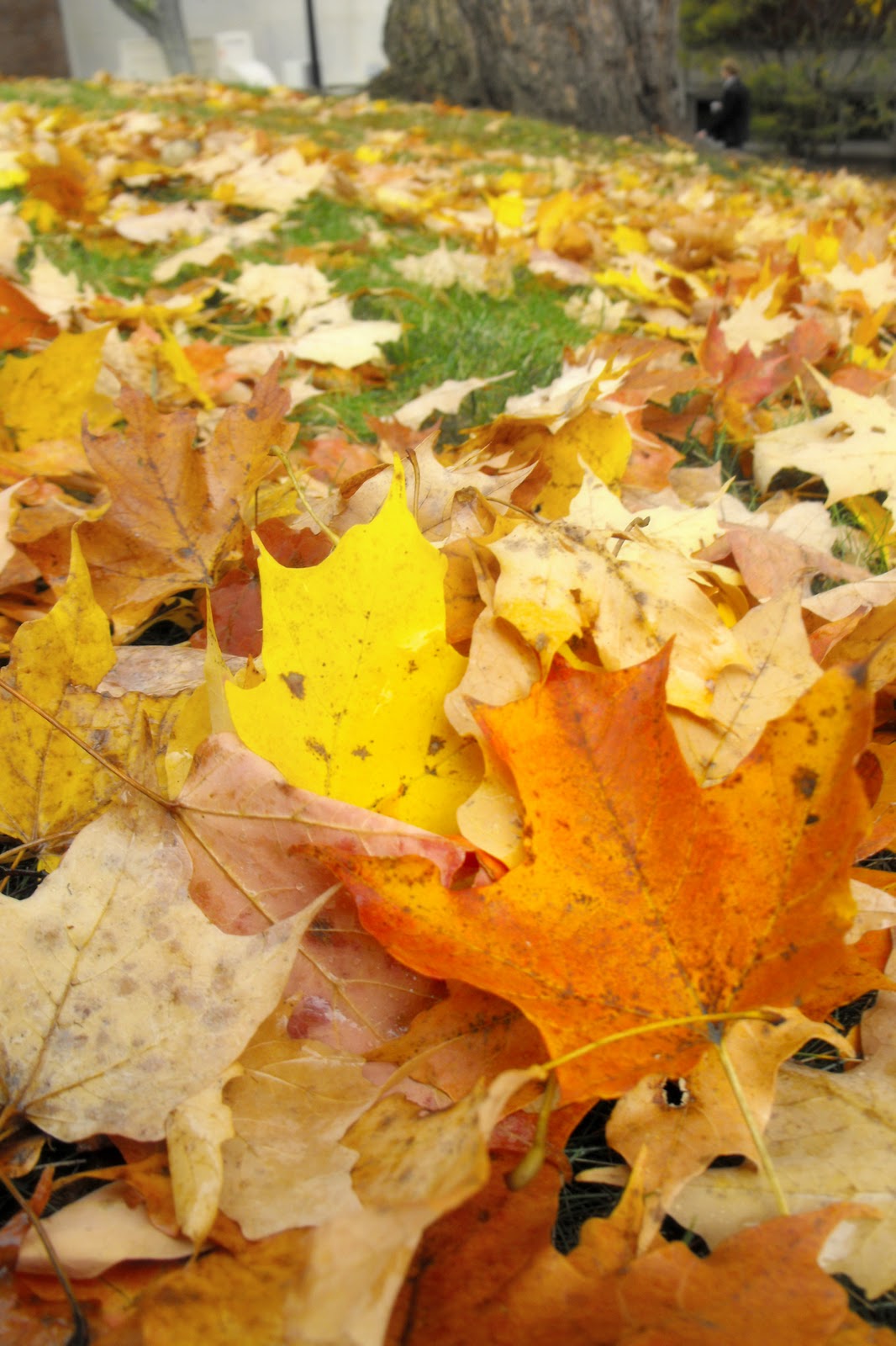
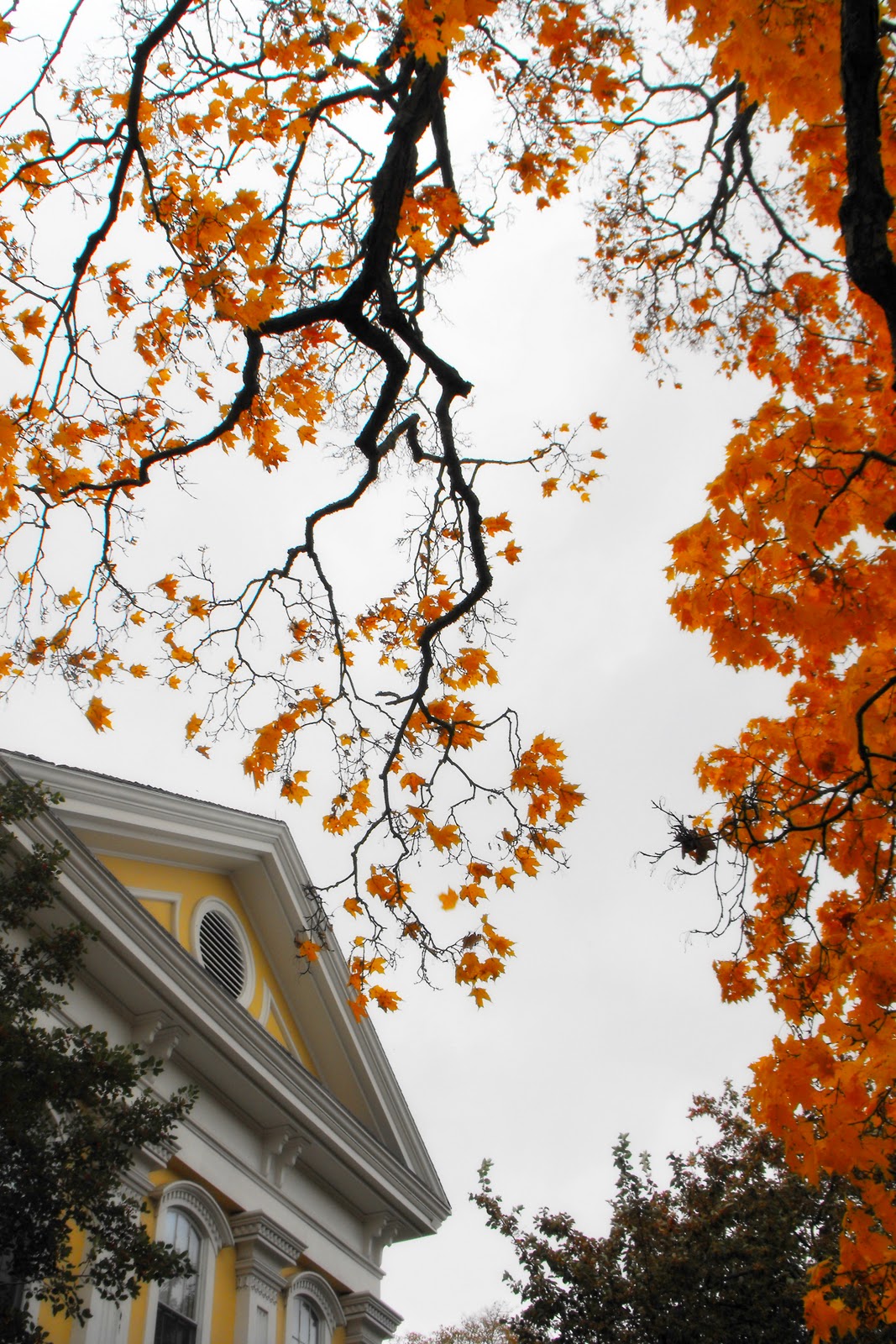
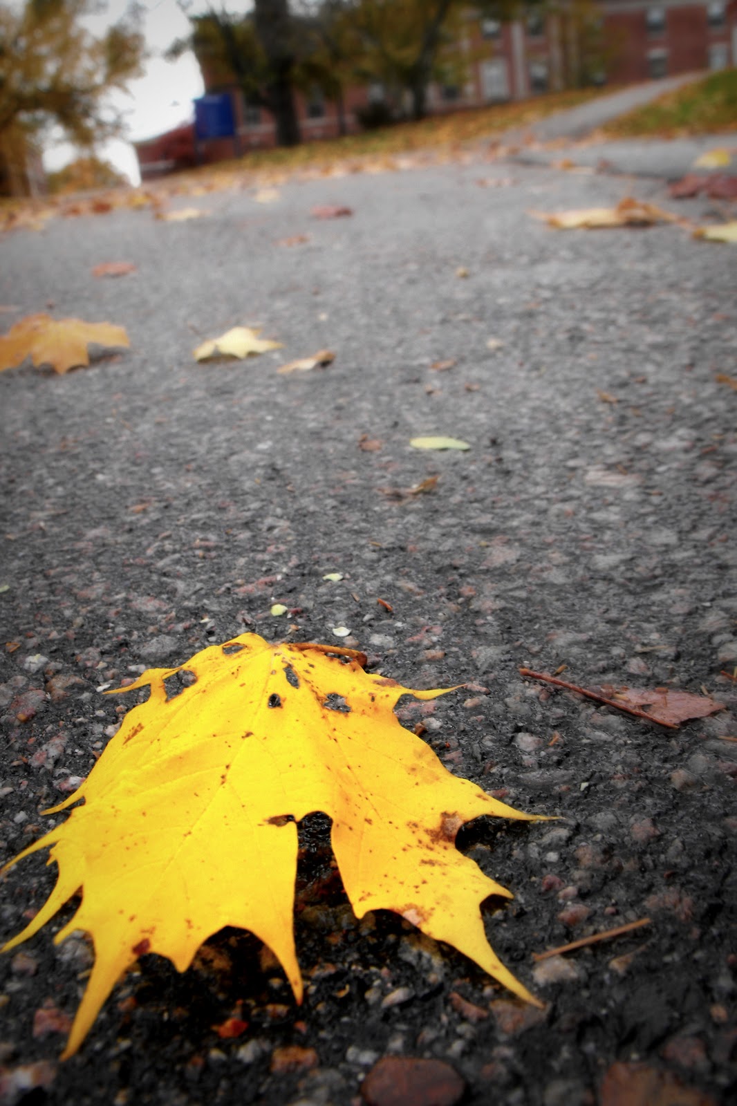
Fall Photos
Last fall I was taking some headshots for my beautiful roommate and I happened to take a few photos of the lovely foliage. Right now we're in that awkward phase between the gorgeous leaves of autumn and the romantic snow of winter, so I figured I'd look through these to cheer myself up. Enjoy!


Sunday, December 5, 2010
Jess and Joel - Wedding Inspiration Boards
My friend Jess is getting married in just under two years. She's still very early in the planning process (i.e. they've gotten as far as picking out a month), and she had a few different ideas for color schemes. I decided to try and make a few inspiration boards for her. For the first one, she had wanted "sunset colors" but her fiancée was afraid it would look tacky. I tried very hard not to make things clash, and I think I did a fairly good job. Also notice that there's a lot of food, both in the pictures and in the color names. I was quite hungry at the time.

(credits: candy buffet, candy corn, lily, daisies, berries, mango, pomegranate, cake, shoes)
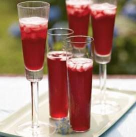
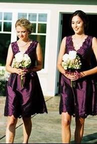
This next one also went with the "sunset" theme, but I wanted to see if I could make it more jewel-toned and autumn-y, as the wedding will take place in September. I don't like it as much as the first one - Jess has a very bright personality - but it's interesting nonetheless.

(credits: banner, drinks, purple dresses, orange flower, purple flowers, cloth flowers, shoes, orange dresses, cake, brulee)
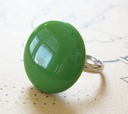
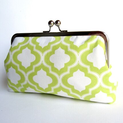
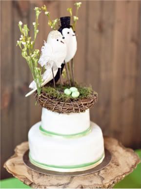
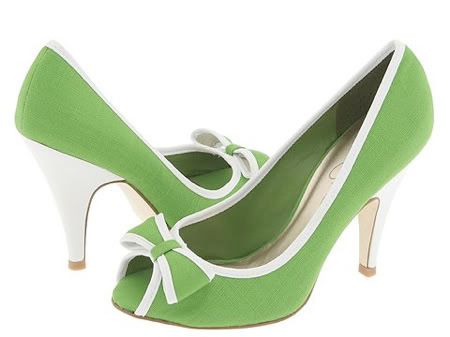
If sunset colors don't work out, they will probably go with green. I think it's a nice color, and I have certainly seen it used very well in weddings. I didn't want to just use that weird muted lime that you see at a lot of weddings - not because it doesn't look good, but because it's so overused - so I tried to go a little bit brighter. I also used ivory to try and soften it up. What do you think?

Subscribe to:
Posts (Atom)